
Introduction
Creating a warm and aesthetically pleasing home begins with the atmosphere you build around you. One of the most effective ways to completely transform a room without changing furniture or spending a large amount of money is through wall paint. Color has a powerful effect on mood, energy, comfort, and the overall personality of a space. Warm aesthetic wall colors have become increasingly popular because they create inviting environments that feel comfortable, peaceful, and visually attractive.
Pinterest-inspired interiors often focus on cozy corners, soft textures, earthy shades, and balanced colors that make rooms appear both elegant and relaxing. Warm aesthetics are not only about making a room look beautiful in photographs; they also create spaces where people genuinely enjoy spending time. Warm shades can make large rooms feel intimate and make small rooms feel comforting rather than restricted.

Whether you want to redesign your bedroom, living room, reading corner, workspace, or apartment, selecting the right wall paint can completely change the emotional feeling of the space. Warm tones work particularly well because they blend with wood furniture, plants, soft lighting, neutral fabrics, and decorative elements commonly used in modern home design.
In this article, you will discover ten beautiful warm aesthetic wall paint ideas inspired by Pinterest trends. You will also learn about materials commonly used, painting preparation methods, and practical tips for achieving a stylish finish. Every idea is designed to help you create a space that feels welcoming, timeless, and effortlessly beautiful.
Materials Used
Before starting any wall painting project, gathering the proper materials helps create smoother results and a more professional finish.
Materials commonly used:
- Interior wall paint
- Paint primer
- Paint rollers
- Paint brushes
- Painter’s tape
- Sandpaper
- Wall putty
- Paint tray
- Protective sheets
- Measuring tape
- Ladder
- Decorative accessories for styling
Having quality materials improves paint application, prevents uneven texture, and helps colors appear richer and more polished.
How to Create a Pinterest-Style Warm Wall Design
Pinterest-inspired spaces usually follow a simple formula. The goal is creating harmony rather than filling every area with decoration.
Step 1: Choose a warm color palette
Select shades that naturally feel soft and welcoming. Earth tones, beige shades, muted browns, terracotta colors, and warm creams work very well.
Step 2: Consider lighting
Natural light changes how paint appears throughout the day. Test samples before painting entire walls.
Step 3: Match furniture and decor
Warm walls pair beautifully with wooden furniture, woven baskets, neutral bedding, linen curtains, and indoor plants.
Step 4: Add texture
Textures make warm aesthetics more appealing. Try soft rugs, blankets, wall shelves, and natural materials.
Step 5: Keep balance
Avoid making every corner visually heavy. Leave empty spaces so the room feels clean and peaceful.
1. Soft Beige Serenity
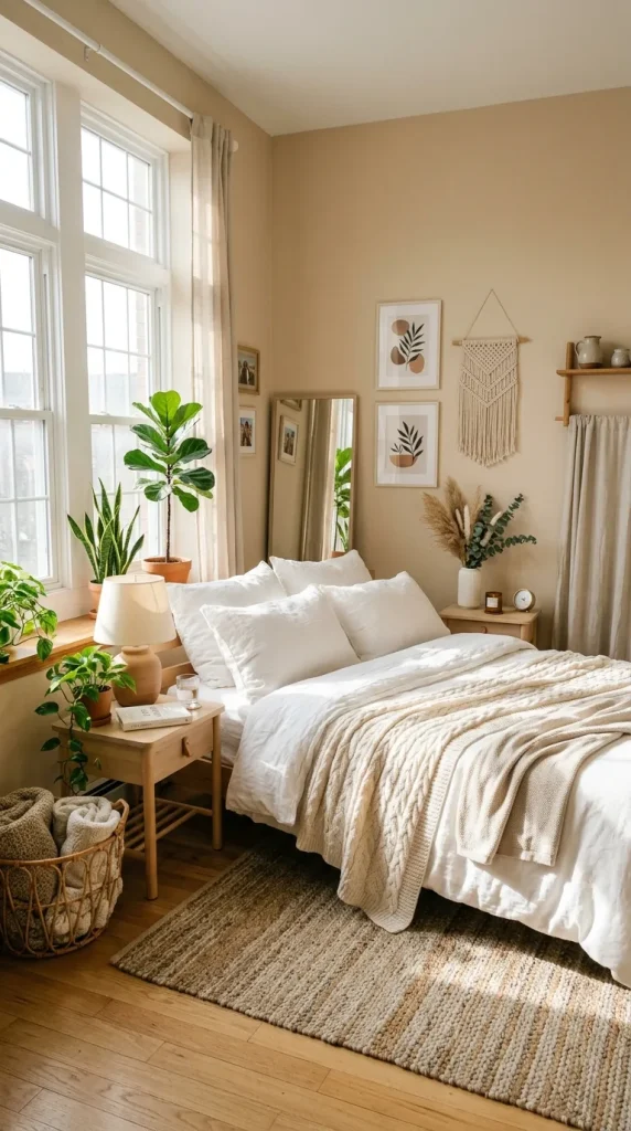
Soft beige remains one of the most timeless warm aesthetic colors because it creates a calm and comforting atmosphere without overpowering a room. Beige sits perfectly between warm and neutral tones, making it flexible enough for almost any interior style. Whether your room contains modern furniture, traditional pieces, or minimalist decorations, beige adapts naturally.
Pinterest-inspired bedrooms frequently use beige because it creates a soft visual background that allows decorative elements to stand out beautifully. White bedding, warm lighting, wooden side tables, and indoor plants look especially attractive against beige walls.
Another advantage of soft beige is that it reflects light gently. Unlike bright white shades that sometimes feel cold or clinical, beige introduces warmth while maintaining brightness. Small rooms can appear more spacious while still feeling cozy.
To make beige walls more interesting, layer textures throughout the room. Add knitted blankets, woven baskets, linen curtains, and textured cushions. The combination creates depth and prevents the room from appearing flat.
Soft beige also works exceptionally well for people who frequently update decorations because almost every color complements it. You can easily change accent colors seasonally without repainting walls.
2. Warm Terracotta Glow
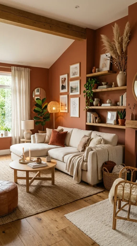
Terracotta has become extremely popular because it brings warmth, personality, and earthy beauty into interiors. Inspired by clay and natural landscapes, terracotta creates rooms that feel grounded and inviting.
This shade instantly adds character without becoming overly dramatic. Pinterest spaces often pair terracotta walls with dried flowers, wooden shelves, cream furniture, and soft fabrics. The result feels artistic yet comfortable.
Terracotta works beautifully in bedrooms, dining rooms, and reading corners because it creates emotional warmth. The color naturally feels welcoming and relaxing.
Because terracotta is stronger than neutral shades, balance becomes important. Pair it with lighter decorative pieces to prevent the room from feeling visually heavy. Cream textiles and natural wood tones help soften the appearance.
Lighting also plays an important role with terracotta walls. Warm yellow lighting enhances the cozy feeling, while cool lighting may reduce its richness.
For homeowners wanting a bold warm aesthetic without using dark colors, terracotta offers an ideal balance.
3. Creamy Vanilla Comfort
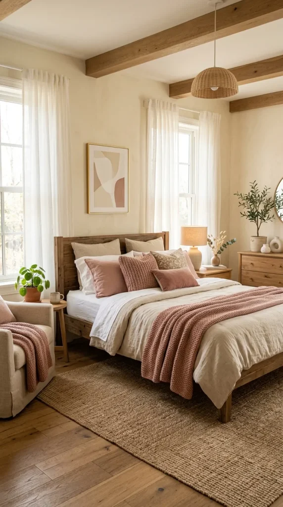
Creamy vanilla shades create soft elegance and timeless warmth. Unlike plain white walls, vanilla colors have subtle yellow undertones that make spaces feel brighter and friendlier.
Pinterest-style homes frequently use creamy shades because they create peaceful backgrounds that photograph beautifully. They feel clean but not sterile.
Cream walls work wonderfully in living rooms and bedrooms where relaxation matters. Pairing them with soft beige furniture and natural decor creates a luxurious appearance without requiring expensive items.
Cream also allows decorative details to become noticeable. Artwork, shelves, plants, and textured accessories appear more prominent against soft backgrounds.
Because creamy vanilla colors reflect light effectively, they are excellent choices for darker rooms. They help increase brightness naturally while maintaining warmth.
Adding warm wooden furniture strengthens the aesthetic even further. Oak tables, woven lamps, and soft neutral textiles complement creamy walls beautifully.
4. Dusty Rose Warmth
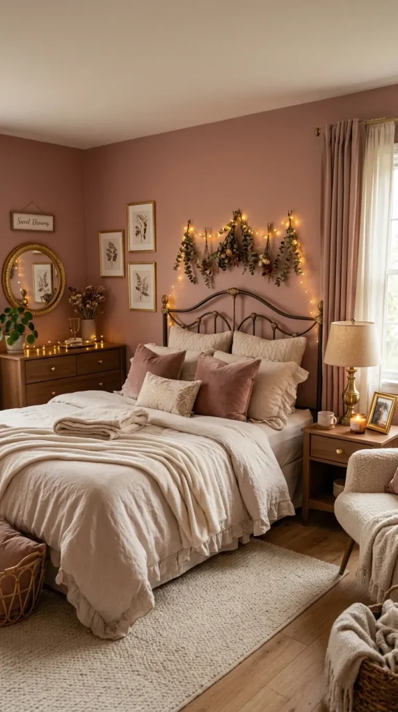
Dusty rose combines softness and warmth in a subtle and elegant way. Unlike bright pink shades, dusty rose appears mature, calming, and sophisticated.
Pinterest-inspired bedrooms often use dusty rose because it creates dreamy environments that feel romantic without appearing overly feminine.
This color pairs beautifully with gold accents, beige tones, wooden furniture, and soft white decorations. The overall effect feels balanced and stylish.
Dusty rose can work as a complete wall color or as an accent wall behind beds and seating areas. Because the color contains muted warmth, it creates comfort while maintaining visual interest.
Lighting influences dusty rose significantly. Warm lighting highlights its cozy qualities and creates a peaceful atmosphere during evenings.
For anyone wanting warmth with subtle personality, dusty rose provides a beautiful solution.
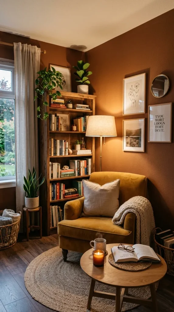
5. Cinnamon Brown Elegance
Cinnamon brown creates rich warmth and timeless depth. Inspired by natural spices and earthy landscapes, it adds sophistication to interior spaces.
Pinterest spaces using cinnamon shades often combine them with neutral furniture and layered textures. The result feels luxurious and cozy at the same time.
Brown shades sometimes receive less attention compared to lighter colors, but modern warm aesthetics have reintroduced them in elegant ways.
Cinnamon walls work especially well in reading spaces, offices, and living rooms because they create comforting environments.
Balance darker walls with lighter decor elements to maintain brightness. Cream cushions, white artwork, and wooden details create beautiful contrast.
The richness of cinnamon tones helps rooms feel welcoming and personal.
6. Warm Taupe Simplicity
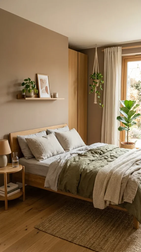
Warm taupe combines brown and gray undertones to create balanced warmth and subtle sophistication.
One reason Pinterest users love taupe is its versatility. It complements many decorating styles including modern, minimalist, rustic, and contemporary interiors.
Taupe walls provide enough warmth to feel comfortable while remaining neutral enough for flexibility.
This shade creates peaceful environments that never feel overwhelming. Bedrooms and workspaces particularly benefit from taupe because it encourages relaxation.
Adding natural textures enhances its beauty significantly. Linen curtains, woven baskets, and indoor plants create depth and visual interest.
Taupe remains an excellent choice for people wanting a refined and timeless aesthetic.
7. Muted Peach Glow
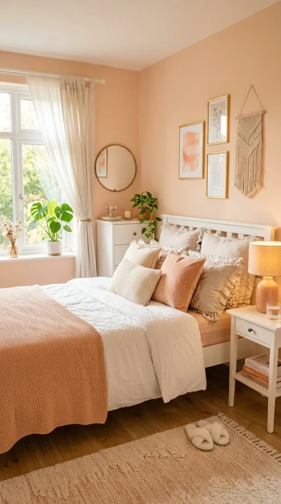
Muted peach introduces gentle warmth and cheerful energy into interiors.
Unlike bright orange shades, muted peach feels soft and balanced. It creates welcoming spaces that appear fresh and youthful.
Pinterest room designs often combine peach walls with white furniture, warm lighting, and natural accessories.
Peach works particularly well in bedrooms and creative spaces because it creates uplifting environments.
Soft textures such as knitted blankets and cushions strengthen the cozy appearance.
Muted peach adds warmth without becoming visually intense.
8. Caramel Latte Tones
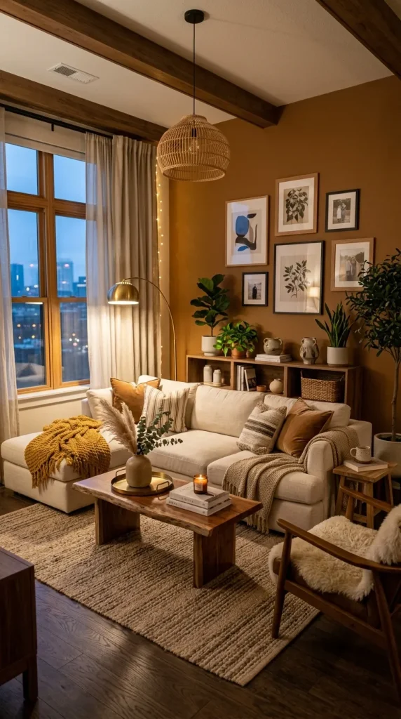
Caramel-inspired shades create richness and comfort similar to warm coffee tones.
These colors feel cozy immediately because they resemble natural earthy elements. Pinterest spaces frequently use caramel shades in modern apartments and living rooms.
Caramel walls pair beautifully with darker woods and neutral fabrics.
The color creates warmth while maintaining sophistication and depth.
Layering textures becomes especially important with caramel shades because it prevents rooms from appearing flat.
The result feels elegant, inviting, and timeless.
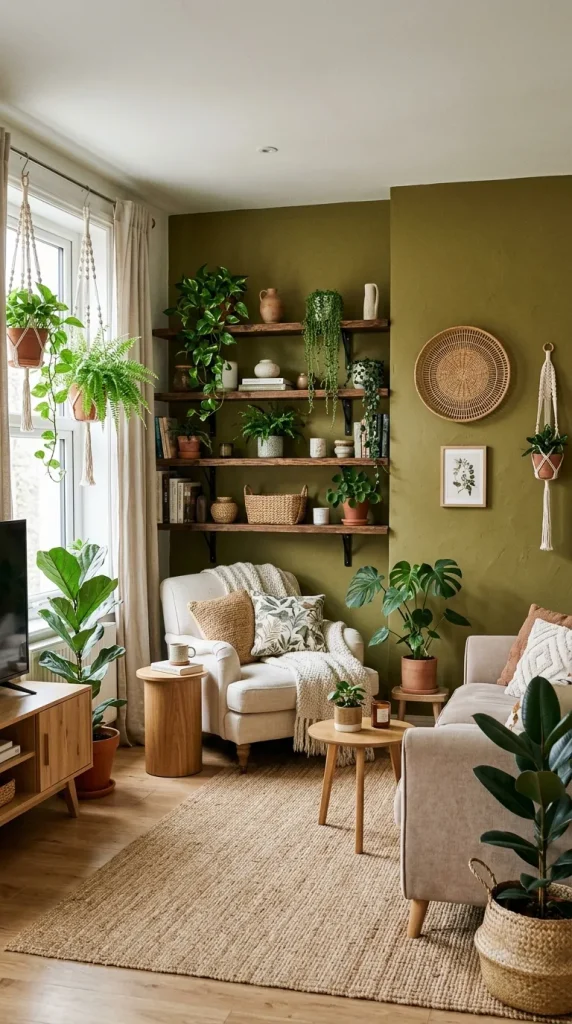
9. Warm Olive Earthiness
Warm olive shades bring nature indoors while maintaining comfort.
Olive colors create peaceful environments and work beautifully with natural materials.
Pinterest-inspired homes often pair olive walls with wooden shelves, plants, and cream decorations.
Olive introduces personality without becoming overpowering.
The earthy quality creates balanced and relaxing spaces suitable for bedrooms and living rooms.
Natural lighting enhances olive walls particularly well.
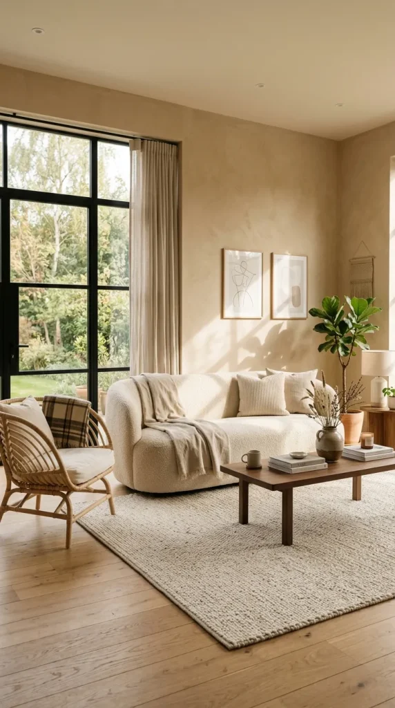
10. Warm Sand Minimalism
Warm sand shades combine simplicity with comfort.
Inspired by beaches and natural landscapes, warm sand colors create relaxing environments.
Minimalist Pinterest homes frequently use sand shades because they create clean yet cozy spaces.
The color works beautifully with soft textiles and natural decorations.
Warm sand also adapts easily to changing decor styles and seasonal accessories.
Its simplicity creates timeless beauty that rarely goes out of style.
Conclusion
Warm aesthetic wall paint ideas are more than simple color choices. They influence mood, comfort, and the emotional atmosphere of a home. Whether you prefer soft beige serenity, earthy terracotta warmth, or elegant cinnamon tones, every color tells a different story.
The secret behind Pinterest-inspired spaces is not expensive decoration but thoughtful balance. Warm colors, layered textures, natural materials, and intentional styling work together to create environments that feel welcoming and beautiful.
Choose a color that reflects your personality, consider your lighting conditions, and create a space that feels like home every time you walk into it.





Leave a Reply